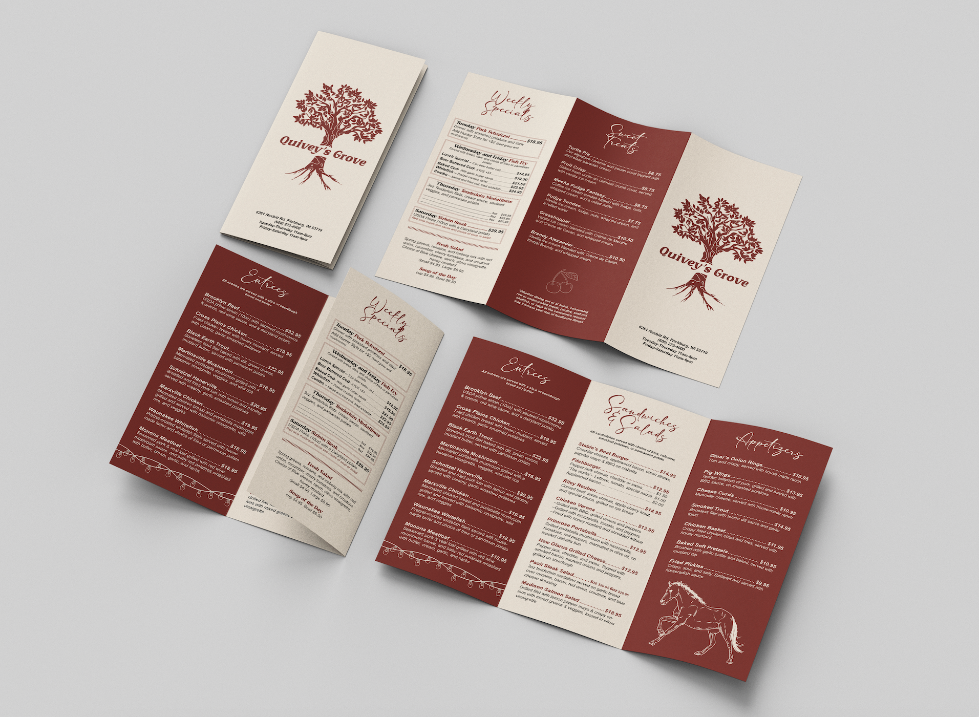
NEW outside menu view
Left to right: inside flap, back, front
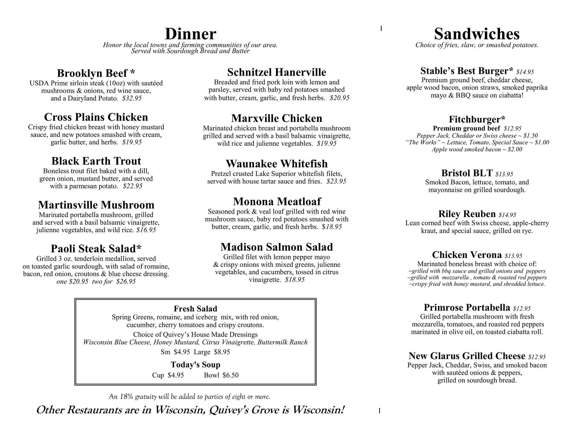
NEW inside menu view
Inside spread
ORIGINAL outside menu view
Left to right: inside flap, back, front
ORIGINAL inside menu view

This Quivey's Grove menu redesign was a project in my layout design class over the Fall 2024 semester. I used Adobe Illustrator, Adobe Photoshop, and Adobe InDesign. The company colors consist of beige, brown, and red while also portraying a more rustic and old-timey vibe. The two buildings on site consist of an antique farmhouse and a revamped horse barn that still possesses plenty of original characteristics from when it was built. I went with a deeper cherry red and reddish beige as my main color palette to embody the company's colors. The original logo was also redesigned to make it a tad more simplified. The cover of the menu was also simplified as all the information on the front could be seen as overwhelming for a first impression of the menu. I use a decorative, larger font to highlight the sections of the menu to draw the eye to categories often searched for. The font on the weekly specials page differs from the font on the other pages in a way to draw the eye through contrast, leading the audience to see this page is special. The fonts overall are also enlarged compared to the original design as the main clientele consists of seniors. I added a few graphic elements as well to emphasize the history behind the restaurant and to raise customer viewing time.
NEW outside menu view
Left to right: inside flap, back, front
NEW inside menu view
Inside spread
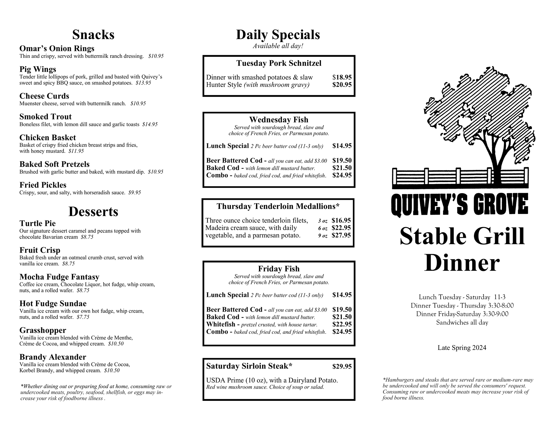
ORIGINAL outside menu view
Left to right: inside flap, back, front
ORIGINAL inside menu view